Guiding CVS Customers' Next Best Actions
Improving customer engagement via personalized and contextual messaging
No time to read? Click or tap here for a TL;DR

~ An Overview
Context
The CVS website and mobile app serve over 44,000,000 customers across various pharmacy, retail, and digital store services.
The Problem
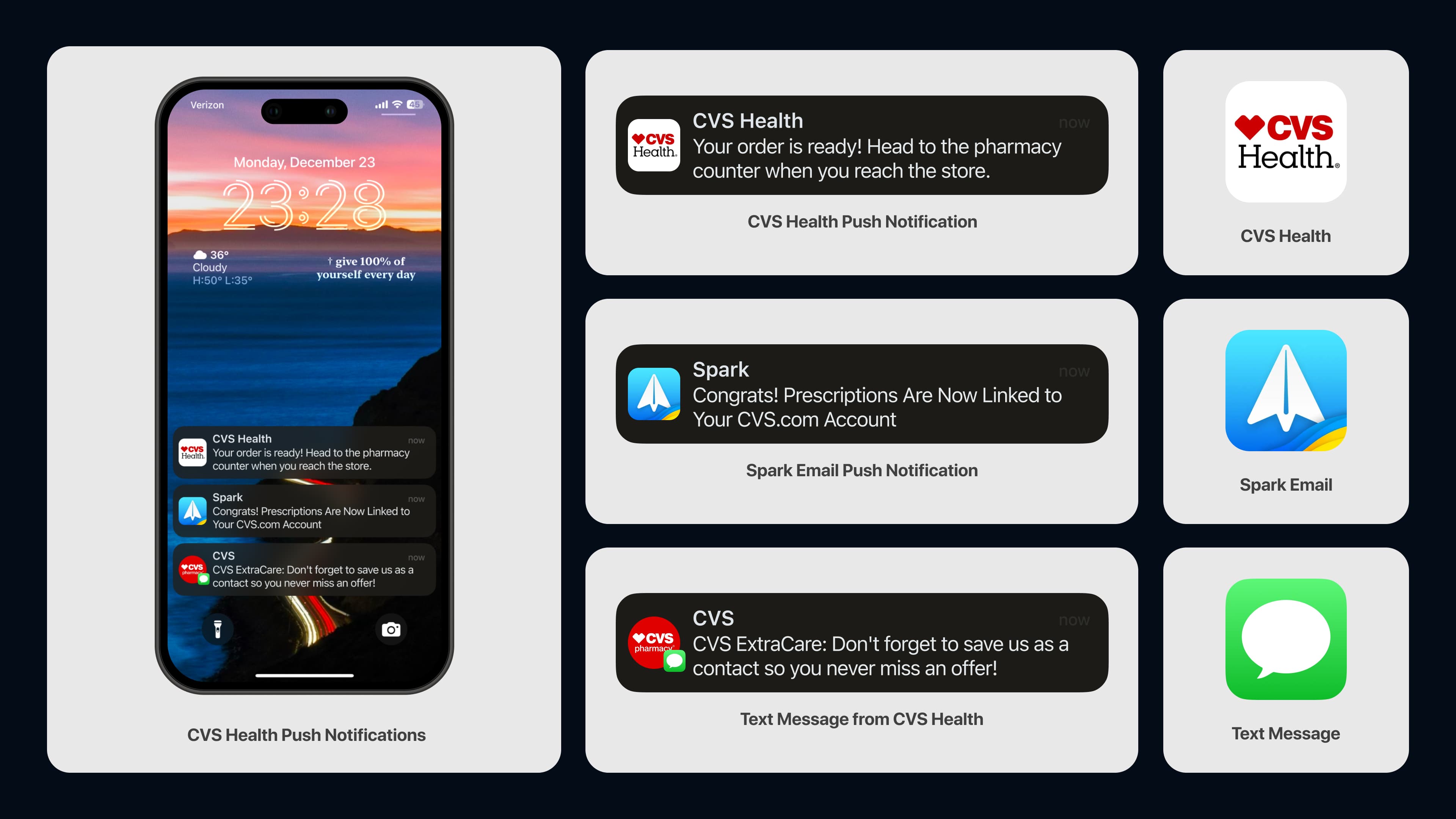
The CVS website and mobile app deliver informational messages to over 44,000,000 customers across various lines of business, including digital store, pharmacy and retail. For the most part, customers who sign up for any CVS service receive all types of messages and communications, regardless of their relevance to them or specific lines of business they sign up to.
The Challenge
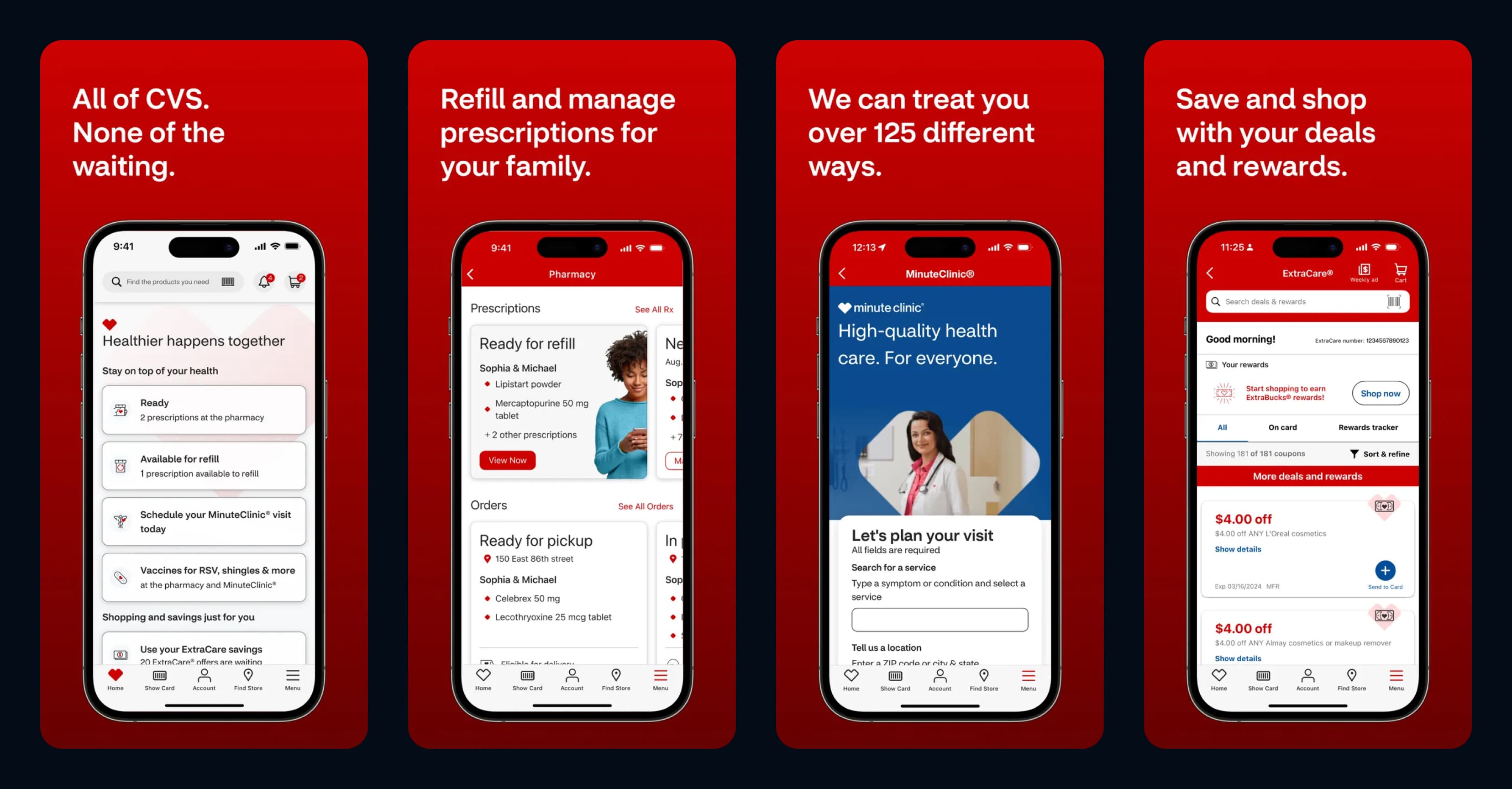
The Digital Reach team was tasked with developing the best approach for delivering contextual, personalized messages to customers through "Next Best Actions" on the CVS mobile app and website.
How might we use "Next Best Actions" to deliver contextual, personalized messaging based on a customer’s account status and user journey, ensuring an optimal digital experience with CVS?
Pausing for Clarity: "Next Best Actions" are personalized recommendations tailored to each user's journey, delivered via notifications, in-app messages, modals, or cards driving engagement based on relevance.
My Role Included:
Leading design definition and direction, strategy, research, feature ideation, prototyping, testing, stakeholder presentations and handoff.
Our Solution:
My team developed "Next Best Action" messaging, targeting customers with different messaging styles based on their unique user journey.
The Result – This is a spoiler! Click or tap here to show the result.
By delivering personalized and contextual "Next Best Actions" via messaging tailored to different account states and user journeys, we:
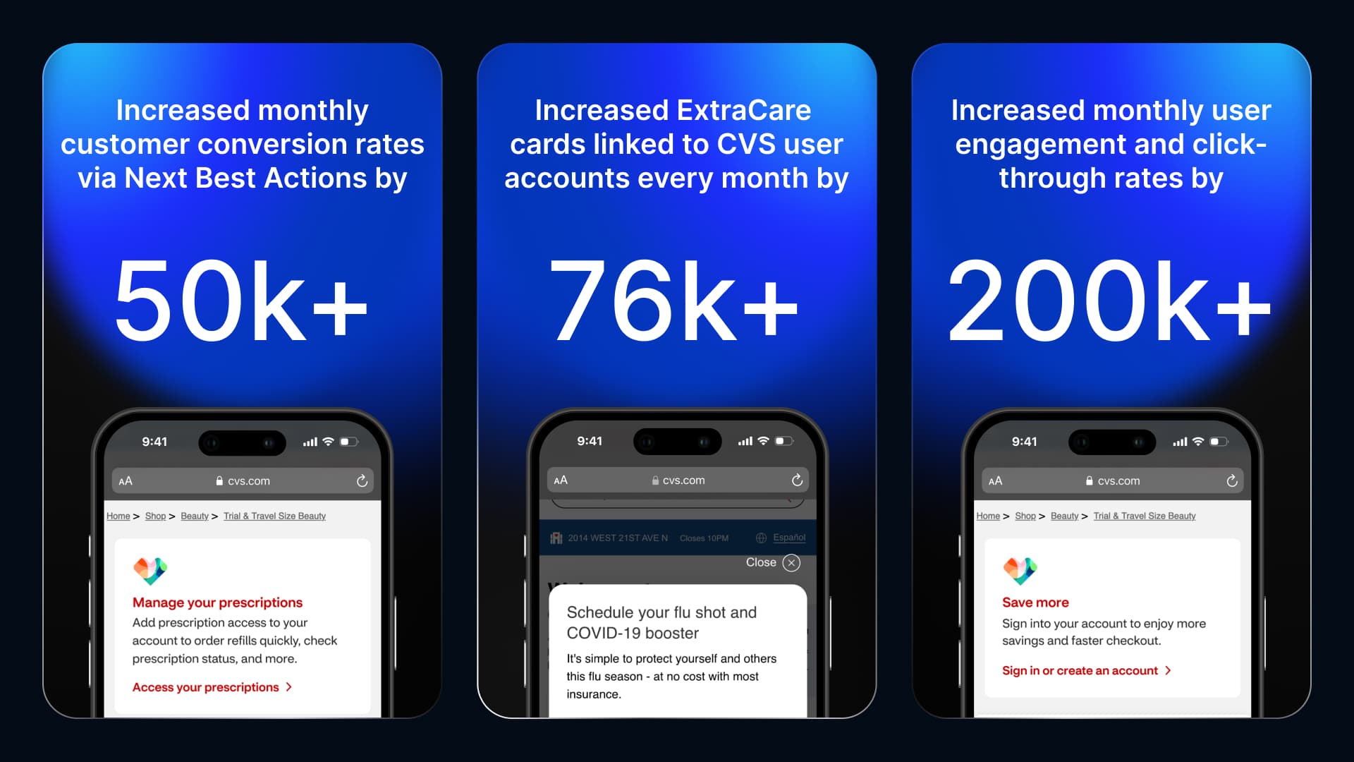
• Increased ExtraCare cards linked to user accounts by 76,000+ through targeted modals, highlighting the benefits of linking cards, fostering stronger customer loyalty, and repeat engagement across CVS services.
• Increased customer conversion rates by over 50,000+ , utilizing built-in messages and push notifications that guided users with clear, contextual, and relevant next steps.
• Enhanced user engagement and increased click-through rates by 15.75% , (200,000 users) highlighting the effectiveness of personalized and actionable Next Best Actions.
1. Researching the Problem
Primary Research
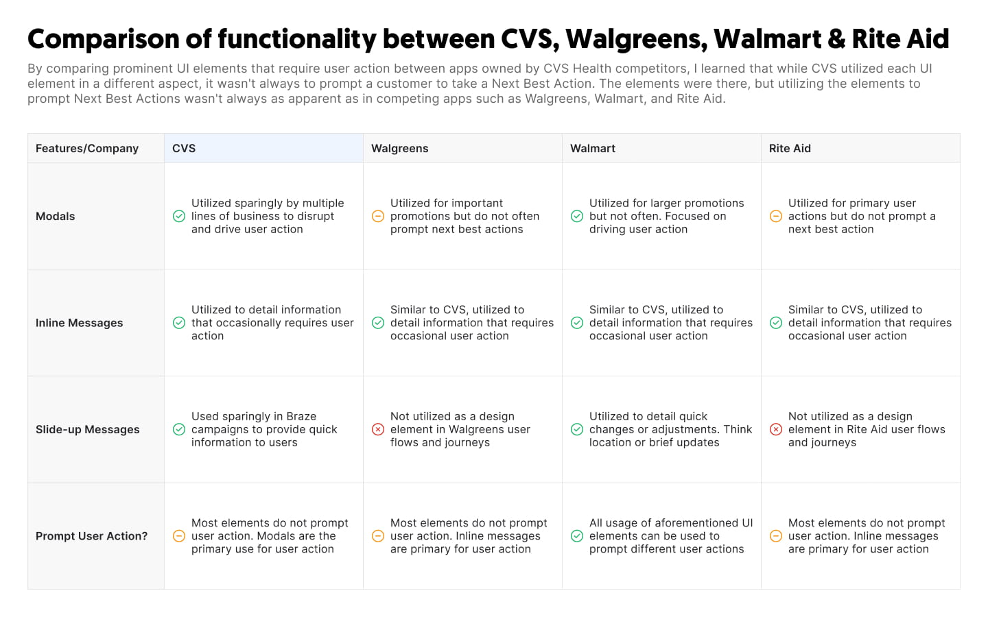
I discovered that each company I researched employed specific messaging components to deliver contextual and personalized information to users, tailored to the journeys and flows they engaged with.
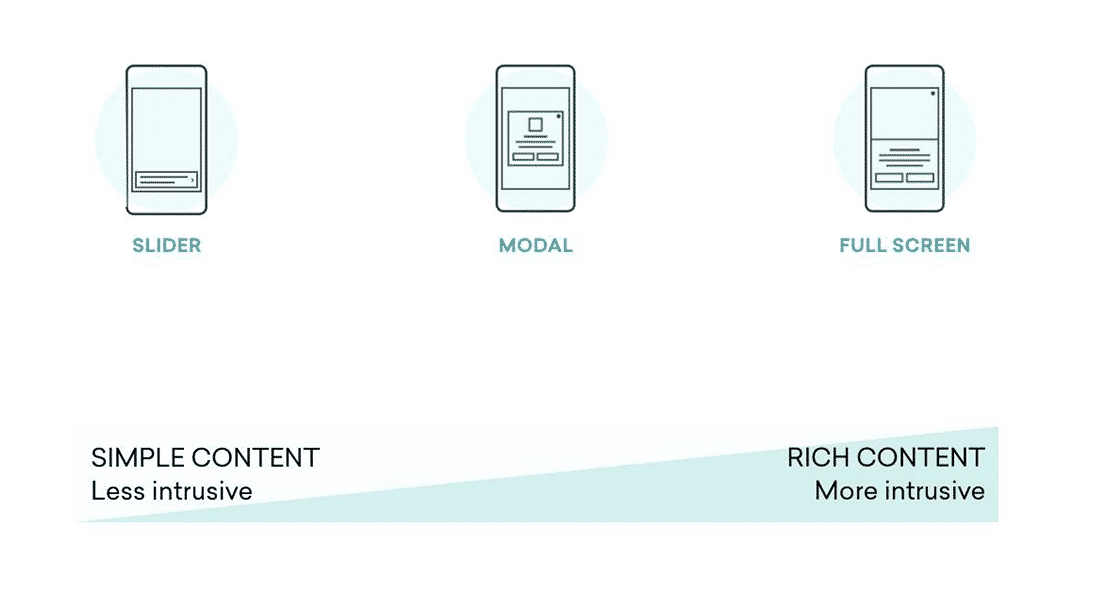
- Modals: Used when disrupting a customer’s journey is necessary to convey important or contextual information.
- Built-in Messages: Used to deliver supporting or contextual information that enhances a customer’s journey.
- Toast Messages: Utilized for supporting or contextual information that is considered helpful but not crucial to a customer’s journey.
A Competitive Analysis
2. Ideation
Defining the Direction
After further research and ideation, I collaborated with the product team to determine the best approach for designs.
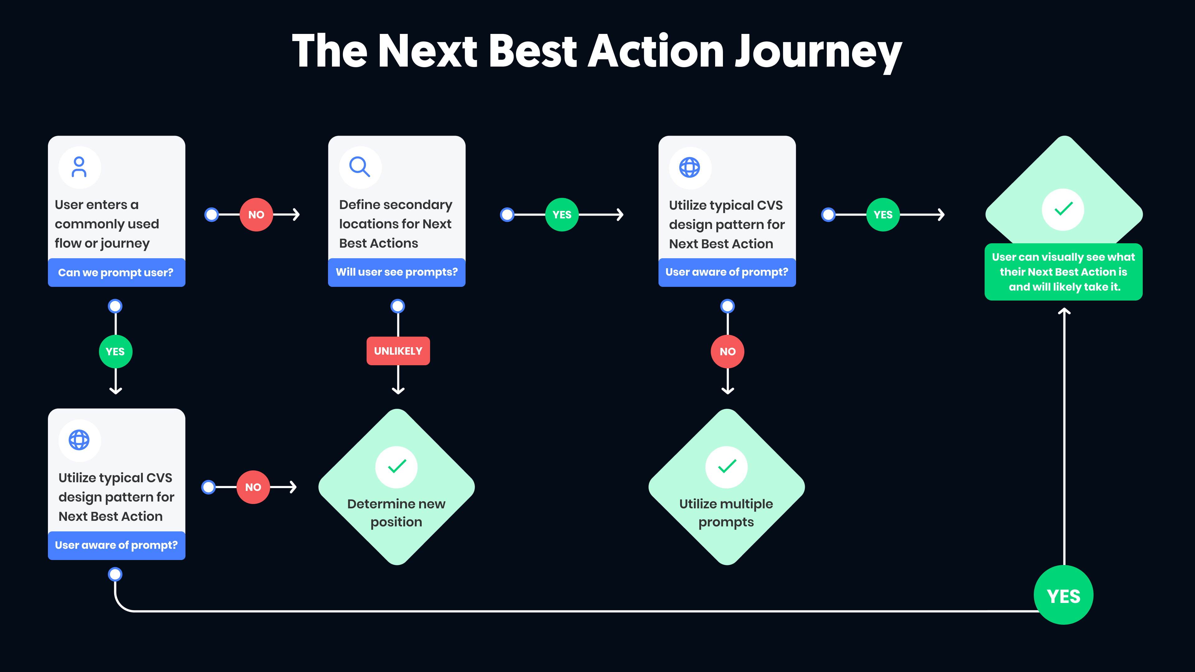
Analyzing the User Journey
I analyzed multiple user journeys where we aimed to incorporate important, contextual messaging through Next Best Actions.
As shown below,
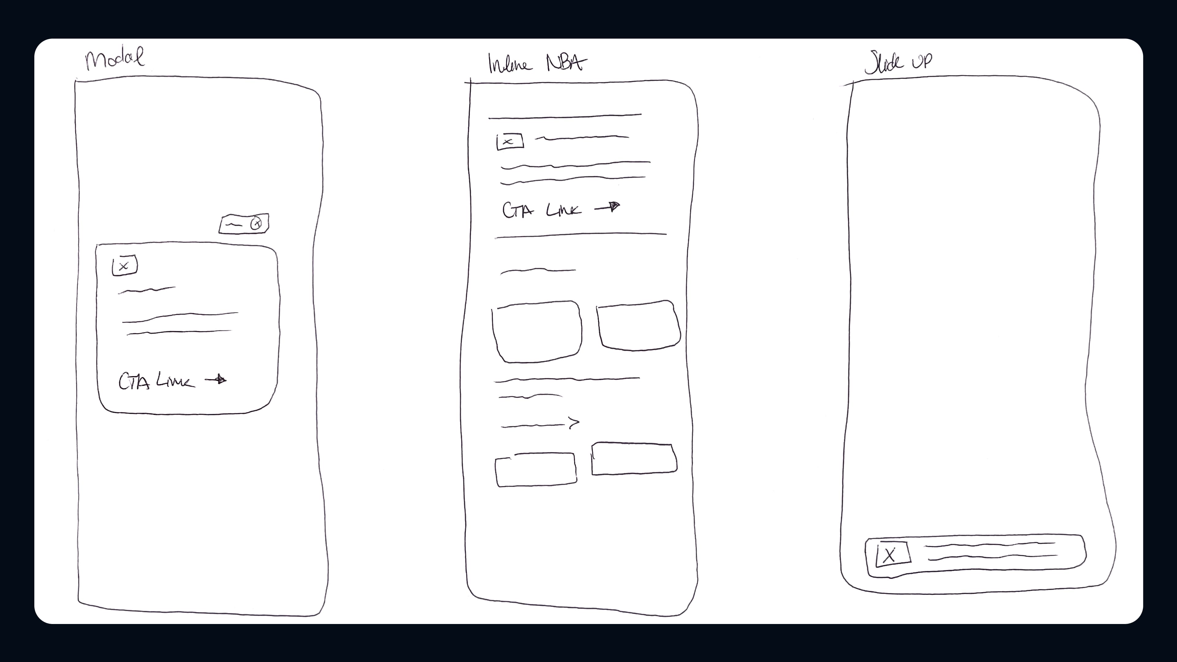
Sketches
After further discussion with my team, the product team, and stakeholders, I sketched potential placements for "Next Best Actions" within the analyzed user journeys.
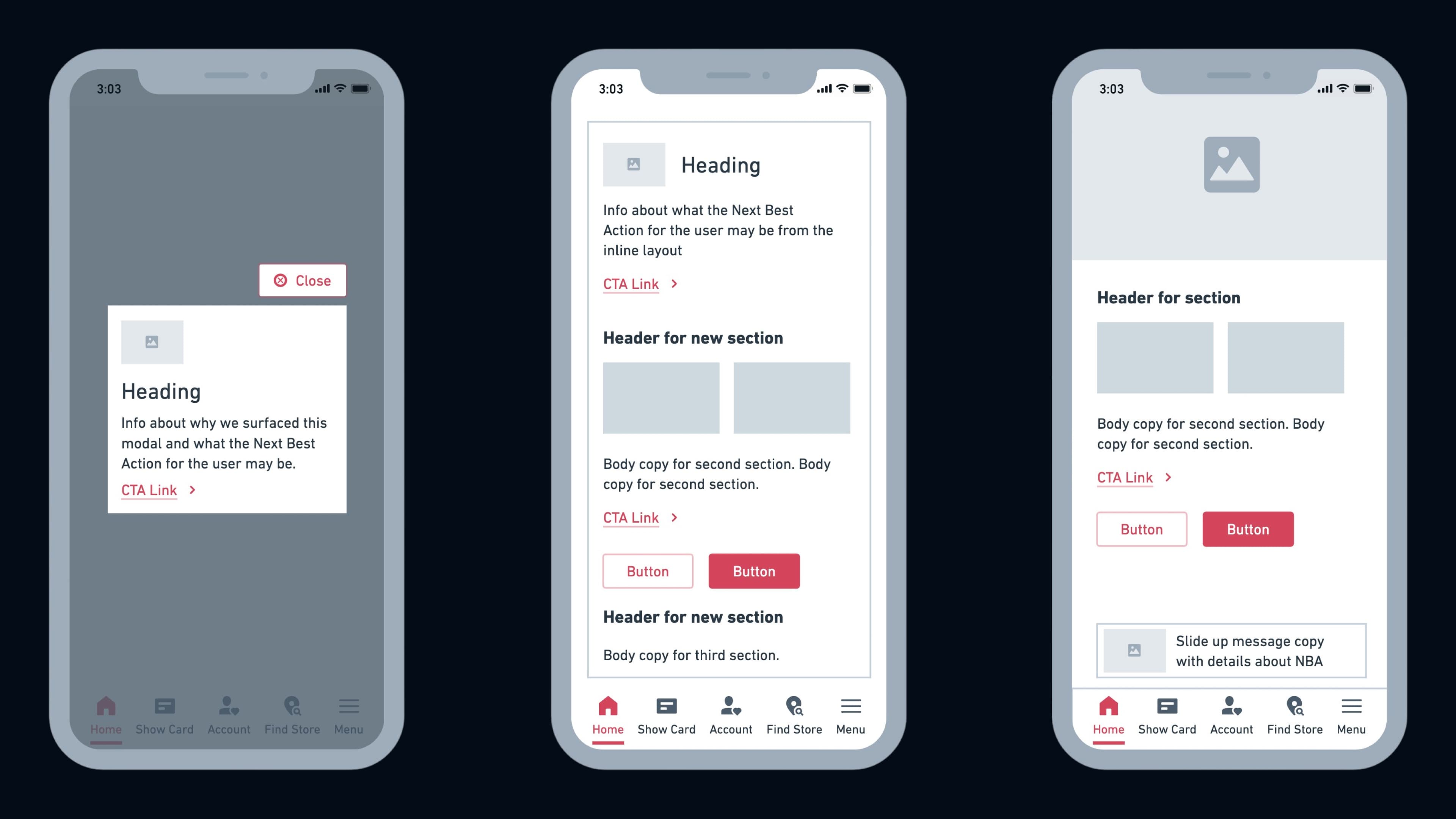
Wireframing
After identifying ideal placements for Next Best Actions, I created mid-fidelity wireframes to define the look and feel of the messaging types within each customer journey.
3. Prototyping & Testing
Designing the Prototype
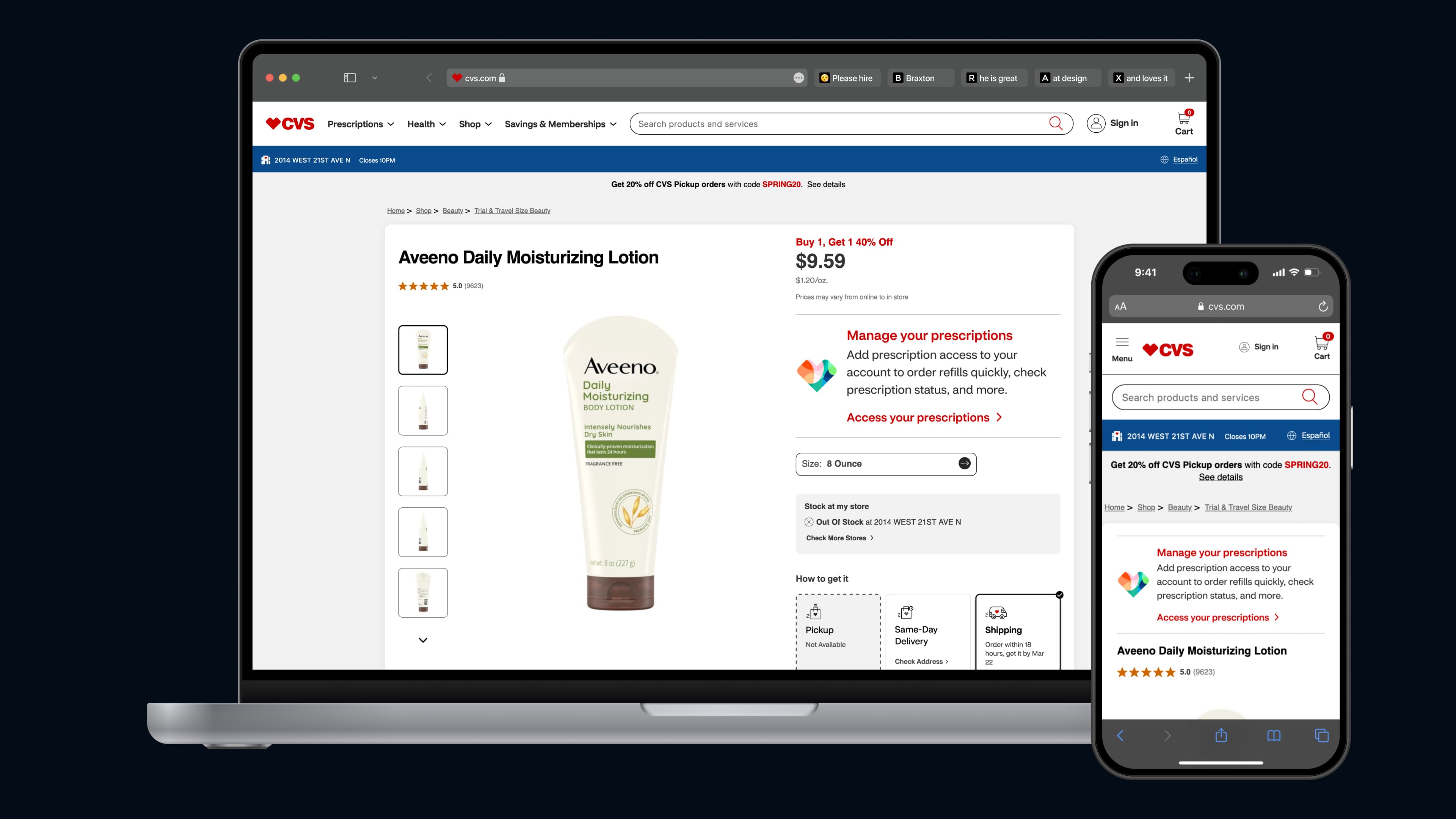
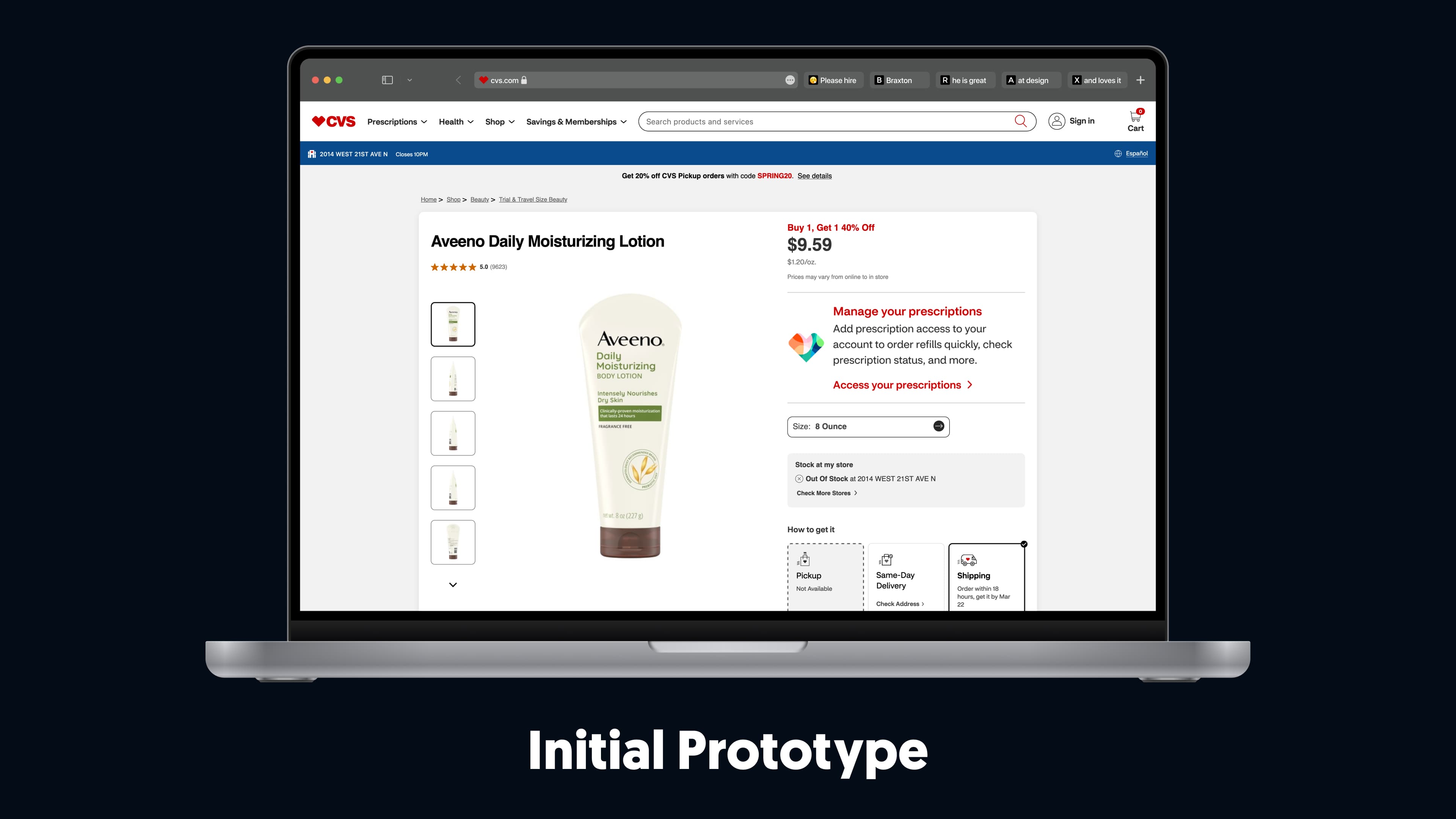
Using my sketches and mid-fidelity wireframes, I designed the initial prototype.
Figma also allowed for quick and efficient updates throughout testing.
Piloting the Designs with Customers
The Monetate A/B tests allowed my team and I to evaluate how customers responded to each message type and the effectiveness of our implemented Next Best Actions.
1. The slide-up message was unclear and unintentionally disruptive. Customers often opened it by mistake while attempting to swipe it off their screen.
2. The pencil banner was too small and narrow, blending into the page resembling an ad rather than a Next Best Action, making it easy for users to overlook.
3. Messaging copy needed to be more specific and actionable. Broad language failed to clearly convey the intended "Next Best Action" to users.
4. Modifying the Design
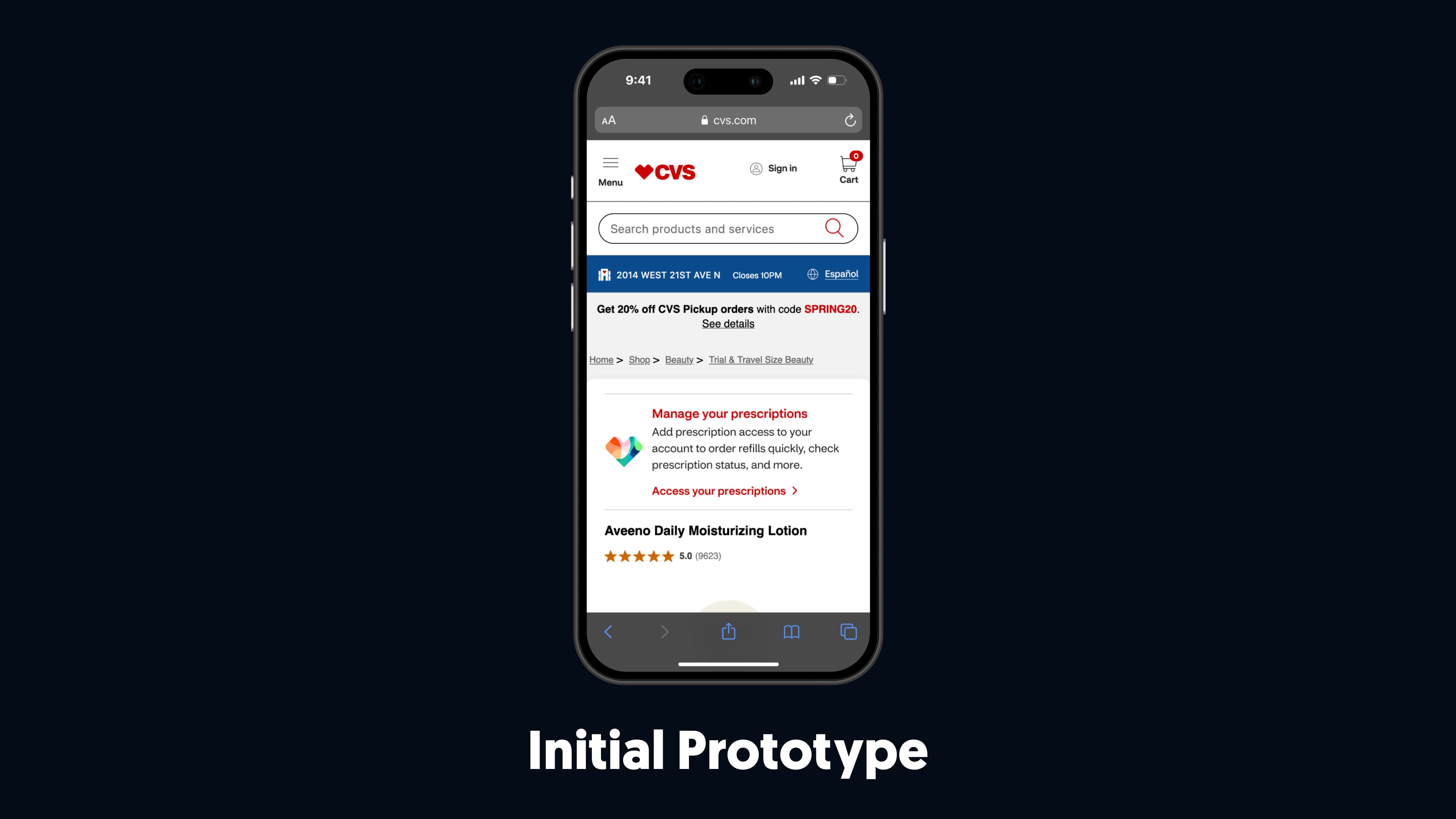
Redesigning from Feedback
Based on the feedback and insights we gathered from the Monetate A/B tests, it was clear that adjustments to the designs were necessary.
The design changes I made from feedback follow:
• I removed the slide-up messages within the Braze campaigns to avoid disrupting customers journeys.
• I redesigned the pencil banner to make it more visible in the user journeys where it was implemented.
• I worked closely with the copywriter on my team to ensure the messaging was clear and concise within the Next Best Actions.
Testing the Final Design
I shared the updated designs with the product team to launch a new Monetate A/B test, ensuring the engineering team was informed of the messaging style changes and ready for future discussions.
• Removing the slide-up message eliminated disruptions , creating a smoother experience while ensuring messages didn’t interfere with users.
• The more prominent pencil banner design stood out within user journeys , effectively capturing attention as a Next Best Action, rather than blending in like an ad.
• Refining the copy to be specific and actionable ensured users could easily understand and take the intended Next Best Action , driving more effective engagement.
Preserving Designs in Discussion with Stakeholders
After working with the product team to gather and synthesize data from the Monetate test, I presented the updated designs to stakeholders. Some expressed skepticism about the visibility and effectiveness of the contextual, personalized messages for Next Best Actions.

5. Handing off the Finalized Design
Conversations with Engineering
- Rather than assuming developers were familiar with Braze's suite,
I created test campaigns for our designs within Braze, providing tangible assets to support handoff discussions.
- Rather than pushing for immediate changes when stepping into the role,
I focused on understanding the team’s dynamics and discussing how I could best support them.
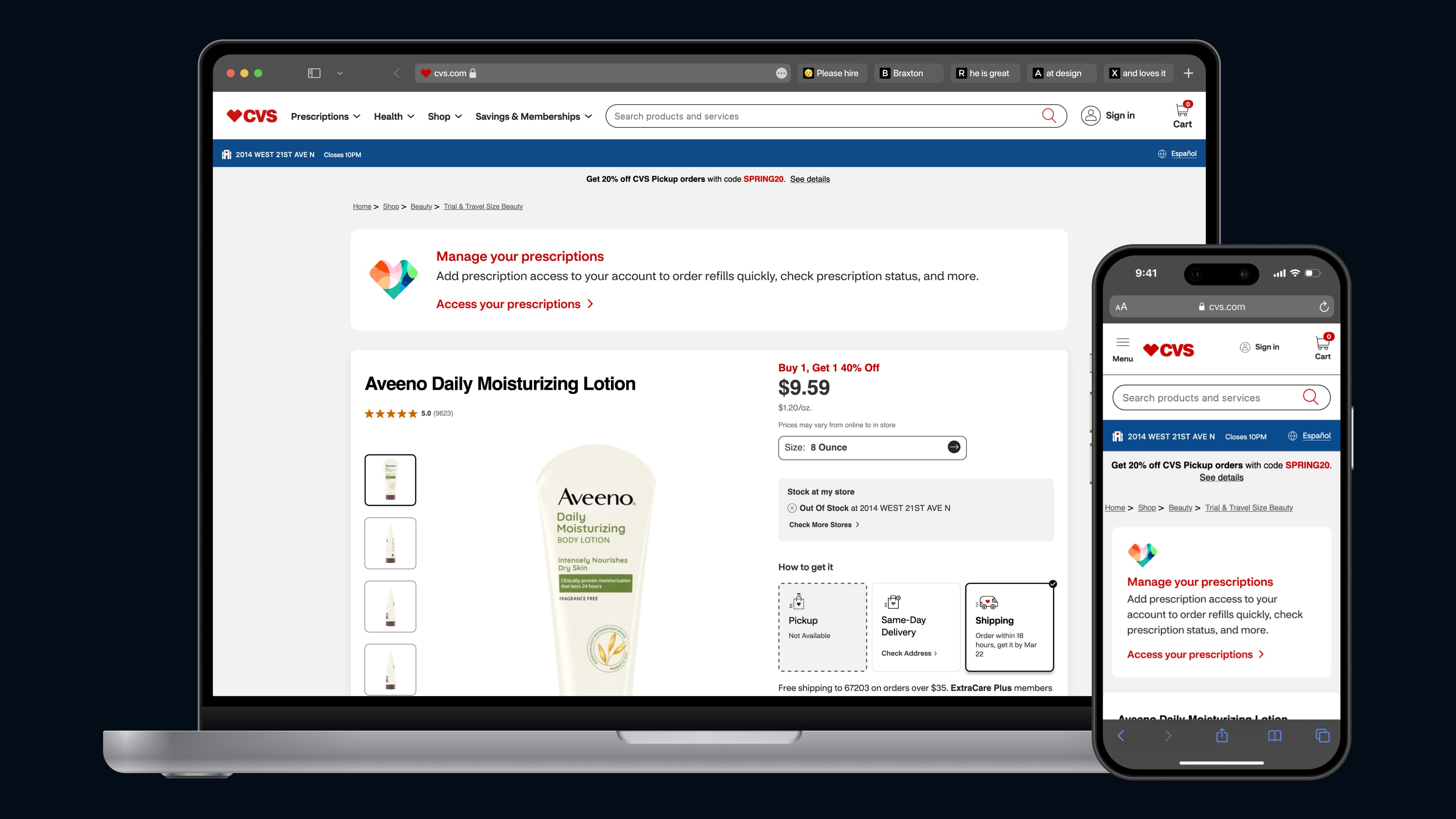
Handing off Finalized Designs
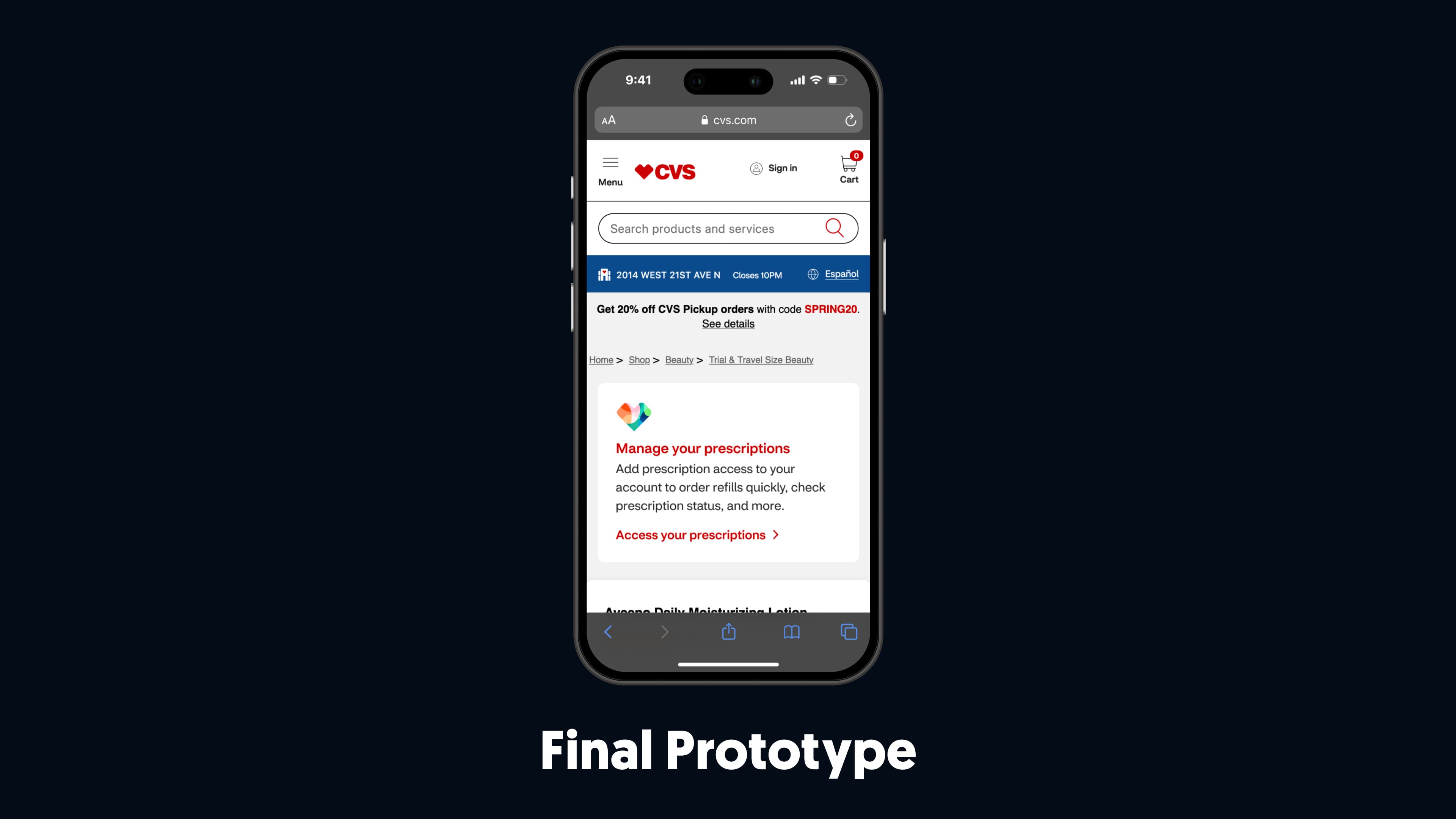
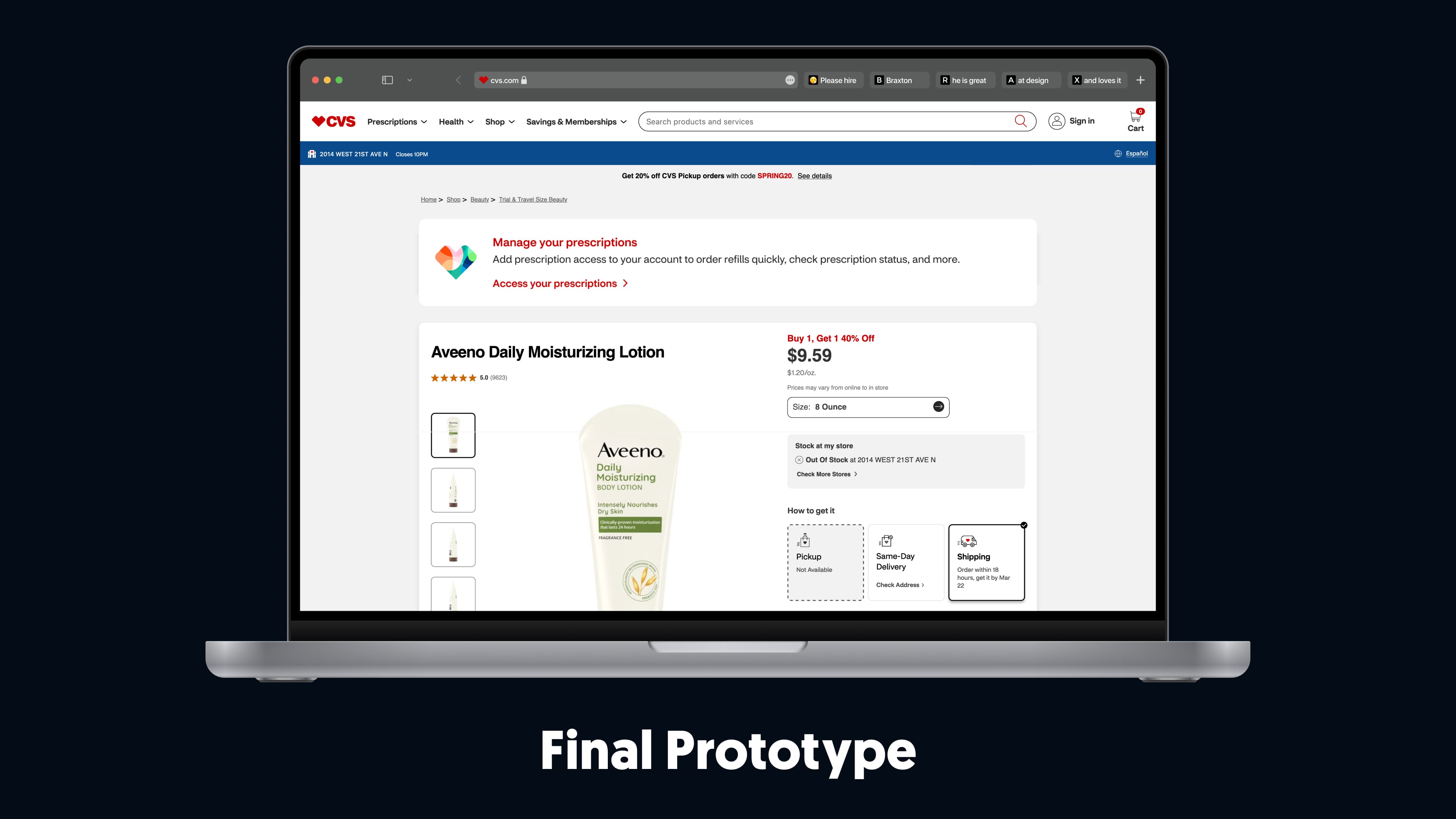
➤ Take a look at the final prototype
6. Launch
Statistics from Going Live
After the engineering team implemented our designs to production, I spoke with the product team to gather metrics on the "Next Best Actions" implemented to share with my team.
• Increased ExtraCare cards linked to user accounts by 76,000+ through targeted modals, highlighting the benefits of linking cards, fostering stronger customer loyalty, and repeat engagement across CVS services.
• Increased customer conversion rates by over 50,000+ , utilizing built-in messages and push notifications that guided users with clear, contextual, and relevant next steps.
• Enhanced user engagement and increased click-through rates by 15.75% , (200,000 users) highlighting the effectiveness of personalized and actionable Next Best Actions.
7. Reflecting
Looking Back

What I Learned
Even with established guidelines in place, clear and concise communication around delivery is essential to keep momentum.
My team and I stayed aligned by keeping communication open, providing detailed notes, quickly adapting to changes, and moving forward with clarity.

What I Would Do Differently
Thanks for Reading!
I deeply appreciate the time you’ve taken to read through my case study and get an understanding of my process. Please reach out with any questions about my "Next Best Actions" project for CVS! I’d love to discuss it with you.
Feel free to take a look at another project by clicking one of the links below.